Styling a Grey Display Cabinet Like a Curator: The Rule of Restraint

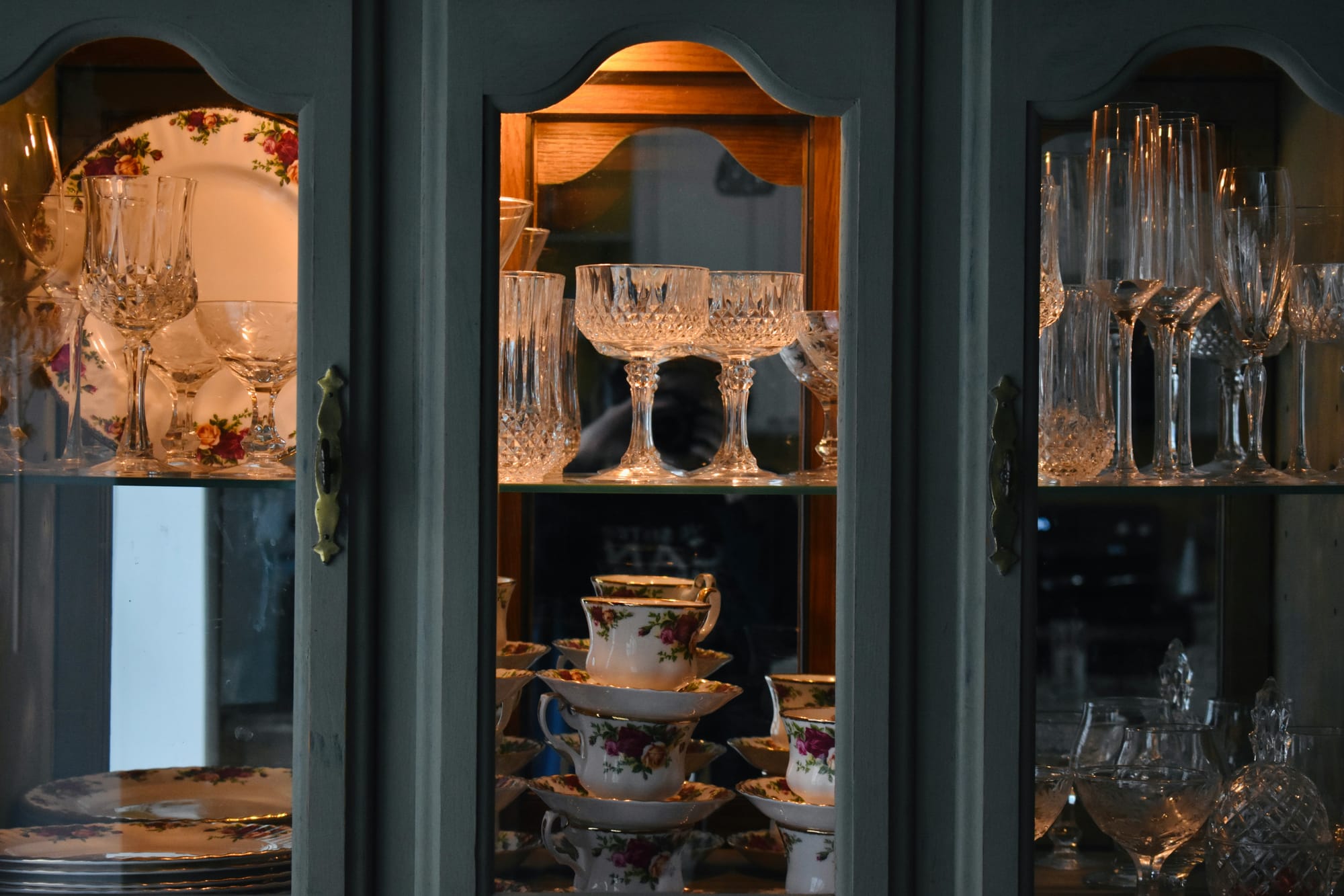
There is a particular moment familiar to anyone who owns a glazed cabinet. You walk past it, glance sideways, and register a vague sense of dissatisfaction. Nothing is broken. Nothing is dirty. Everything you love is in there — the wedding china, the holiday finds, the mismatched teacups from your grandmother, three framed photographs, a candle you have never lit. And yet it looks less like a display and more like a very tidy jumble sale behind glass.
The instinct at that point is to add something. A trailing plant, perhaps, or a decorative bowl to "pull it together". This almost never works, because the problem was never a shortage of objects. The problem is that there are too many, and the cabinet has quietly stopped being a display and started being storage with a window.
Museum curators solved this a long time ago. Walk through any well-designed gallery and you will notice how little is actually on show relative to what the institution owns. The V&A holds well over two million objects; you see a fraction of them at any given time. The rest sit in reserve, waiting their turn. What makes the visible pieces sing is not their rarity but the space around them — the deliberate emptiness that tells your eye where to settle.
A grey display cabinet is an unusually good candidate for this approach, and an unusually cruel one if you ignore it. Grey gives you a quiet, even backdrop with no grain, pattern or warmth of colour to distract from what you have chosen to show. It is the same low-contrast logic that has pushed grey through the rest of the British home, from kitchen carcasses to the grey dressing table mirrors that slot into alcoves and box rooms without making a small bedroom feel any smaller — a surface close in tone to the wall behind it stops registering as an object. In a cabinet, though, that neutrality cuts both ways. It hides nothing. Every surplus object sits there in plain sight.
This article works through the curatorial method in four stages: what to remove, how to arrange what survives, how to handle the specific challenges of a grey backdrop, and how to keep the display alive over time without starting again from scratch.
Start by Taking Everything Out: The Case for Subtraction
Before you move a single teacup one shelf to the left, empty the cabinet completely.
This sounds like unnecessary drama. It is the most important step in the process. The reason is psychological rather than practical: objects that are already in place enjoy an enormous, unearned advantage. Leave a vase on the second shelf and you will find yourself justifying its presence rather than assessing it. Put it on the dining table alongside everything else you own and it has to compete on merit.
So clear the lot. Lay it out across a table, or a clean bedsheet on the floor if the collection is large. Group things loosely as you go — ceramics here, glassware there, sentimental oddments in their own huddle. It is the same exercise that settles most domestic storage arguments, whether you are emptying the airing cupboard before choosing between a blanket box, an ottoman bed or under-bed drawers or emptying a cabinet before restyling it: the size of the pile tells you far more than any capacity figure. You will almost certainly discover you own three near-identical items, a piece you had forgotten entirely, and at least one thing you have been dusting for six years without affection.
The Three-Question Filter
Now assess each object against three questions. Not one. Not two out of three by generous interpretation. Three.
Does it hold genuine meaning? A christening mug from 1974 qualifies. A promotional glass from a garden centre does not, however serviceable it is.
Does it carry visual quality at viewing distance? Stand back three or four paces — roughly where you would actually see the cabinet from a sofa or doorway. Fine detail vanishes at that range. Silhouette, colour and scale survive. Anything that reads as an indistinct blob from across the room is contributing nothing but occupancy.
Does it belong to a recognisable group? Objects gain strength in company. A single blue-and-white plate is an item; six of them constitute a collection, and collections command attention that individual pieces cannot.
Items passing all three go into the display pile. Items passing one or two go into a second pile, which is not a rejection pile — we will come back to it in the final section, where it becomes rather useful. Items passing none can go to the charity shop with a clear conscience.
Aim for Sixty Per Cent Full
Here is the number that will feel wrong: fill each shelf to around 60 per cent of its capacity, which in practice means three to five items or groupings per shelf, depending on their size.
Most people load a shelf to about 90 per cent and then wonder why it looks anxious. The difference between the two figures is negative space, and negative space is not wasted room. It is a design material in its own right — the visual equivalent of a pause in conversation. It signals that a choice has been made.
Test this yourself. A shelf holding two ceramic vessels and a stack of three books, with clear air between the groupings, reads instantly as intentional. Push eleven items onto the same shelf and the eye cannot find a resting point, so it treats the whole thing as texture and moves on.
A grey display cabinet raises the stakes considerably here. Oak grain, painted colour and dark-stained timber all supply visual interest of their own, which absorbs a certain amount of clutter and disguises it. Grey supplies none. It is a flat, quiet ground that presents whatever sits on it with total honesty. That neutrality is precisely why grey suits a curated display so well — and precisely why an overfilled grey cabinet looks worse than an overfilled cabinet in any other finish.
Subtract first. Everything that follows depends on it.
Arranging What Survives: Triangles, Groupings and the Eye-Level Rule
You now have a much smaller pile of objects and an empty cabinet. Resist the urge to start placing things. The first move happens before any object goes in.
Set the Shelves Before You Set the Objects
Most cabinets in this category come with adjustable interior shelving, and most owners never touch it. That is a missed opportunity. Sort your surviving pieces into rough height bands — under 10cm, 10 to 20cm, and taller — then reposition the shelves so each band sits in a compartment with roughly a hand's width of clearance above it.
The reason is simple. A 12cm bowl marooned in a 35cm gap looks stranded, while a tall jug wedged in with two centimetres of headroom looks apologetic. Matching shelf spacing to contents is the single fastest improvement available in a grey display cabinet, and it costs nothing but ten minutes and a screwdriver.
One Grouping Logic Per Shelf
Objects arranged individually scatter. Objects arranged by a shared attribute cohere.
Pick one attribute per shelf and stick to it. It might be collection — all the Cornishware together. It might be material — glass with glass, brass with brass. It might be colour family, or it might be scale. Any of these work.
What does not work is mixing two logics on the same shelf. Group four items by colour, then add two more because they are the same material, and the shelf loses its organising idea. The eye senses a system, fails to identify it, and reads the whole arrangement as accidental. One rule per shelf, applied without exception.
Build Triangles, Not Rows
Within each grouping, work in threes at differing heights.
Place a tall item, a medium item and a low item so their tops describe a triangle rather than a flat line. Your eye resolves that shape almost instantly, which is why it feels settled rather than restless. Rows of equal-height objects, by contrast, read as inventory.
Where you lack height variation, manufacture it. A short stack of hardbacks makes an excellent riser. So does a small wooden box, an upturned bowl or a slab of offcut marble. Two or three centimetres of lift is enough to break a flat line.
Odd numbers help, and this is not superstition. Two identical objects placed side by side create symmetry, and symmetry closes a composition down — the eye pairs them, resolves the relationship and departs. Three creates a slight imbalance the eye has to work at, which holds attention for longer.
Read the Cabinet as One Composition
The commonest structural error is treating four shelves as four separate projects. They are not. Anyone looking at the cabinet sees a single rectangle divided into bands, and the bands need to relate to each other.
Three principles govern this:
Put your strongest piece at eye level, roughly 140 to 160cm from the floor for a standing adult. This is the shelf that gets seen first and remembered longest, so it should not be hosting the also-rans.
Put visual weight low. Dense, dark, solid objects belong on the bottom shelves, where they anchor the composition. Reverse this and the cabinet looks top-heavy and faintly unstable.
Put delicacy high. Fine glass, pale porcelain and small-scale pieces read better above eye level, where light usually reaches them more generously.
One last check: crouch and stand. Glazed doors have mullions, frames and shelf edges that will slice through an object at certain angles. Shift anything that ends up bisected by a vertical bar. Composition means nothing if the door frame is standing in front of it.
Making Grey Work for You: Contrast, Back Panels and Light Temperature
Grey is not one colour. It is a family, and the branch yours belongs to determines which of your objects thrive and which quietly disappear.
Audit What Vanishes
Spend two minutes doing this properly, because it saves a great deal of guesswork later. Stand back and identify every piece that has lost its edges against the interior.
Cool, blue-based greys — the steely tones common in gloss and high-shine finishes — flatten anything silvery or transparent. Pewter, chrome, clear glass, mirrored ornaments and pale grey-white ceramics all merge into the background. Warm greys and greige do the opposite: they mute cream, bone china, unglazed stoneware and brushed brass, which end up looking slightly dirty rather than warm.
The pieces that gain definition on grey are consistent across both undertones. Warm timber. Black. Deep jewel tones — emerald, oxblood, indigo. Matte white, which reads as crisp rather than washed out. If your collection leans heavily towards the items on the vanishing list, you have two levers to pull.
Treat the Back Panel as a Canvas
The back panel is the most underused surface in the whole cabinet, and altering it changes everything in front of it.
Peel-and-stick veneer or vinyl is the low-commitment option. Cut to shelf width, applied to the rear panel, entirely reversible, and available in enough finishes to solve most contrast problems. Warm walnut behind cool grey is a reliably good pairing.
Painted MDF inserts offer more control. Cut panels to fit each shelf recess, paint them in a colour that opposes your problem — a deep ink blue, a soft ochre, a near-black — and slot them in. They lift out whenever you change your mind.
Wallpaper cut to shelf width introduces pattern, which works beautifully behind plain ceramics and terribly behind anything decorated. Choose one or the other; pattern behind pattern is a fight nobody wins.
Mirror is the specialist choice. It doubles reflected light and shows the reverse of your objects, which is excellent for glass and cut crystal and unforgiving of anything with an unfinished back.
Use Light Temperature as a Corrector
Many grey cabinets now arrive with integrated LED strips, often with multiple brightness levels and a night mode. What the manuals rarely mention is that bulb temperature does real colour work.
Warm white, around 2700K, counteracts a cool grey's clinical cast. It softens blue undertones and flatters timber, brass, cream and skin tones in framed photographs. This is the default choice for a living or dining room in the UK, where evening light is doing most of the heavy lifting for a good part of the year.
Neutral white, around 4000K, preserves colour accuracy. Choose it if you are displaying coloured glass, glazed ceramics or anything where the true hue matters more than atmosphere.
Direction matters as much as temperature. Top-down strip lighting rakes across objects and emphasises form and texture, which suits ceramics and sculpture. Edge lighting from the shelf front illuminates translucent items from within, making coloured glass glow rather than simply reflect.
If your cabinet has dimming, use it as a two-state system: brighter and cooler during the day when it competes with daylight, low and warm after dark when it becomes an ambient light source. Same objects, two entirely different displays.
Running the Cabinet as a Rotating Exhibition
Remember that second pile — the objects that passed one or two of the three questions but not all three? This is where they earn their keep.
Do not think of them as rejects. Think of them as your reserve collection, which is exactly what a gallery would call them. The pieces are not gone; they are off-stage, awaiting a turn. That reframing matters, because it removes the guilt that stops most people editing properly in the first place. Nothing has been given away. It has been rested.
Store the Reserve Properly
Most grey display cabinets pair a glazed upper section with a solid-door cupboard or drawers below, and that lower half is the natural home for the reserve. Box things by category rather than throwing them in loose — a plastic crate for glassware, a lidded box for smaller ceramics, tissue or bubble wrap for anything fragile.
Then label the boxes. Not elaborately; a strip of masking tape and a marker pen is plenty. The point is that in three months' time, when you fancy a change, you can find what you own in ninety seconds rather than unpacking three boxes on the carpet and giving up halfway through. A reserve you cannot navigate is just a cupboard full of objects.
Keep a rough written inventory if the collection is substantial. A note on your phone is sufficient. It sounds fussy until the first time you use it.
Change One Thing, Four Times a Year
Wholesale restyling is a job nobody does twice. Rotation, by contrast, takes twenty minutes and is genuinely enjoyable.
The method is simple: swap one shelf, or one grouping, roughly every three months. That single change refreshes the whole cabinet, because the eye notices difference rather than absolute arrangement. Four small edits a year keeps a display alive indefinitely.
A few rotation approaches worth trying:
Seasonal colour, where a shelf shifts towards greens and pale ceramics in spring, warm ambers and brass through autumn. Grey accommodates all of it without argument, which is the quiet advantage of a neutral interior.
New acquisitions, where anything bought or inherited in the past quarter gets promoted to eye level for its debut, displacing something into the reserve.
The single-theme takeover, where one shelf is given over entirely to one collection — all the glassware, all the pottery from a particular trip — and everything else on that shelf steps back for a season.
Fold Maintenance Into the Rotation
Dust film, glass smears and fingerprints will undo careful styling faster than any compositional error. A beautifully composed shelf behind cloudy glazing looks neglected, and neglect is the opposite of curation.
So make each rotation a cleaning session too. Glazing cleaned inside and out, shelves wiped, objects handled and checked. Handling them has a secondary benefit: you reassess as you go, and pieces you have stopped seeing become visible again. Occasionally one gets retired on the spot.
Here is the practical dividend of the entire approach. Twelve objects take a fraction of the time to dust that forty do. The restraint that makes the display look better also makes it markedly easier to maintain — which is a rare instance of the elegant option being the lazy one as well.
The Confidence to Leave Space Empty
Everything in this approach comes down to one uncomfortable habit: choosing not to fill a gap.
That is harder than it sounds. A half-empty shelf looks unfinished to most of us, and the impulse to complete it runs deep. But the gap is doing work. It is what separates a collection from a pile, and a display from a cupboard. Curators do not leave space empty because they have run short of objects. They leave it empty because it is the only way to say look at this one.
If you take a single action from this article, take the first one. Empty the cabinet. Do it on a wet Sunday with the radio on and a cup of tea, lay everything out, and be honest about what earns its way back in. The rest — the triangles, the shelf heights, the back panel, the bulb temperature — is refinement. The editing is the substance.
Grey rewards this discipline more than most finishes. It offers no grain to distract, no colour to compete, no pattern to absorb your mistakes. What you put in a grey display cabinet is what people see, in full, without mitigation. That is a demanding backdrop, but it is also a generous one: get the selection right, and the cabinet gets out of the way entirely, leaving nothing between the viewer and the object.
So the question worth sitting with is not what else could go in. It is this: if you had to reduce your display to twelve objects, which twelve would you choose — and what does it say that you already know the answer?
Most of us do. The pieces that matter are rarely in doubt. The difficulty has never been identifying them; it has been giving them room to be seen. That is all restraint really is.